 Bitcoin Yearly Highs and Lows
Zoom in with touchscreen: Touch and hold with ONE finger then drag.
Zoom in on desktop: Left click and drag.
Reset: Double click.
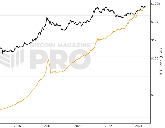
This live chart shows both the yearly highs and yearly lows for Bitcoin (BTC/USD), giving a complete picture of how Bitcoin’s price evolves year by year. Instead of focusing only on peaks or bottoms, this chart highlights the full range of Bitcoin’s performance across each year.
Why Compare Bitcoin Highs and Lows?
- Clearer perspective: Seeing highs and lows together shows the volatility and resilience of Bitcoin across bull and bear markets.
- Long-term growth: Despite deep pullbacks, Bitcoin’s yearly lows keep trending higher, while yearly highs push further into record territory.
- Investor insight: The distance between highs and lows illustrates Bitcoin’s cyclical nature — crucial for understanding risk and opportunity.
Key Insights from the Chart
- Early years (2012–2015): Bitcoin was highly volatile, but yearly lows quickly climbed from single digits into the hundreds.
- 2017 bull run: A new all-time high near $20,000, with lows still far above previous cycles.
- 2020–2021: The COVID cycle saw lows over $5,000 and highs close to $70,000, cementing Bitcoin as a mainstream asset.
- Ongoing adoption: Each cycle sets a higher floor and a higher ceiling, reflecting growing global demand.
Bitcoin Price in Context
The Bitcoin yearly high and low chart is one of the best ways to see Bitcoin’s long-term trajectory. While short-term price swings dominate headlines, the rising pattern of both highs and lows shows why many view Bitcoin as a durable, long-term store of value.
Stay updated with this live chart to track Bitcoin’s price range each year — a powerful tool for traders, investors, and researchers who want the full picture.
You May Also Be Interested In

Bitcoin Lightning Capacity
Cumulative capacity held by all nodes on the Lightning Network.
Addresses with Non Zero Balance
Live chart showing the number of unique non zero addresses.

Hashprice Volatility
30-day 60-day, 90-day volatility of Hashprice.
Make smarter decisions about Bitcoin. Instantly.
Access the Bitcoin and Global Macro Charts that really drive Bitcoin’s price.
+40 chart alerts. Never miss critical levels on charts again.
Analysis newsletter. Manage your emotions at market extremes.
Private Tradingview indicators. See Bitcoin chart levels in real time!
Cancel anytime.
Any information on this site is not to be considered as financial advice. Please review the Disclaimer section for more information.